Maestro Design System
Building and maintaining a multi-brand design system
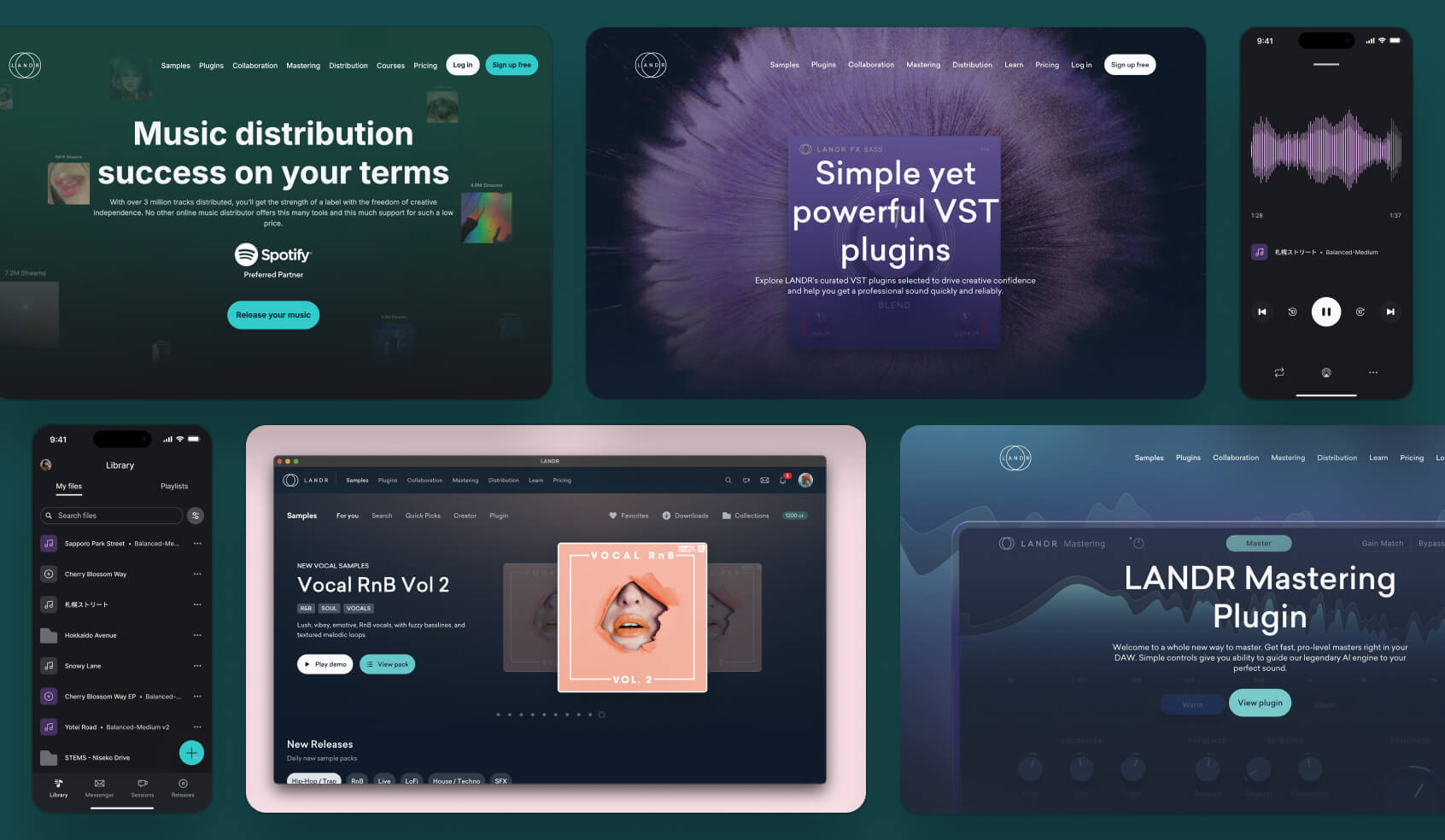
Miscellaneous screens
Small part of the LANDR ecosystem.
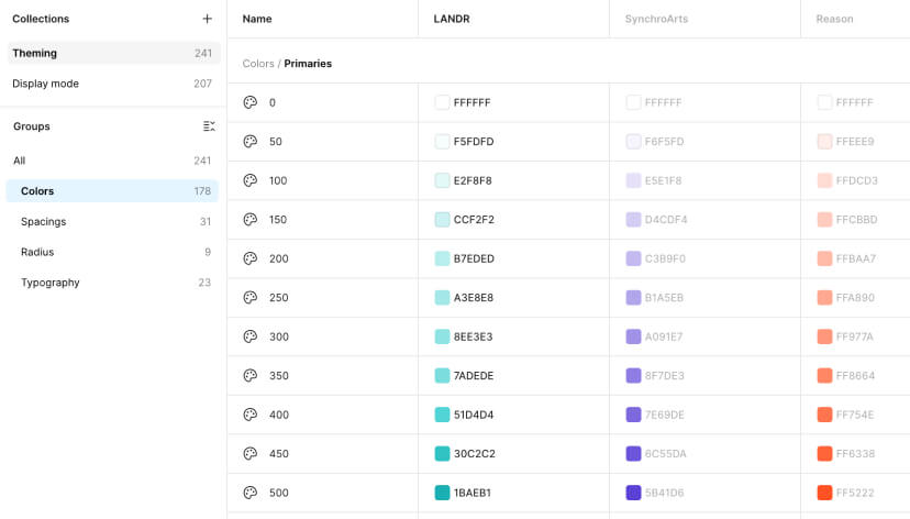
Maestro foundation
Tokens, variables, and styles
Multi-brand support
Easy brand and mode switching.
The situation
As LANDR rapidly grew to 7 million users across 100 countries, so did the inconsistencies across its platform. Visual elements and design patterns varied across the board, and the codebase was becoming cumbersome and hard to maintain. I soon realized it was time to create a unified design system. Enter Maestro—the solution to bring consistency, efficiency, and scalability to LANDR’s ecosystem.
The mission
In 2021, I teamed up with Ben, a seasoned front-end developer, and Andrea, another talented front-end developer, to tackle the project of building and maintaining LANDR’s design system. Our goal was to create a scalable, consistent, and user-friendly foundation that would empower both designers and engineers. Together, we set out to streamline workflows, eliminate redundancies, and elevate design at LANDR.
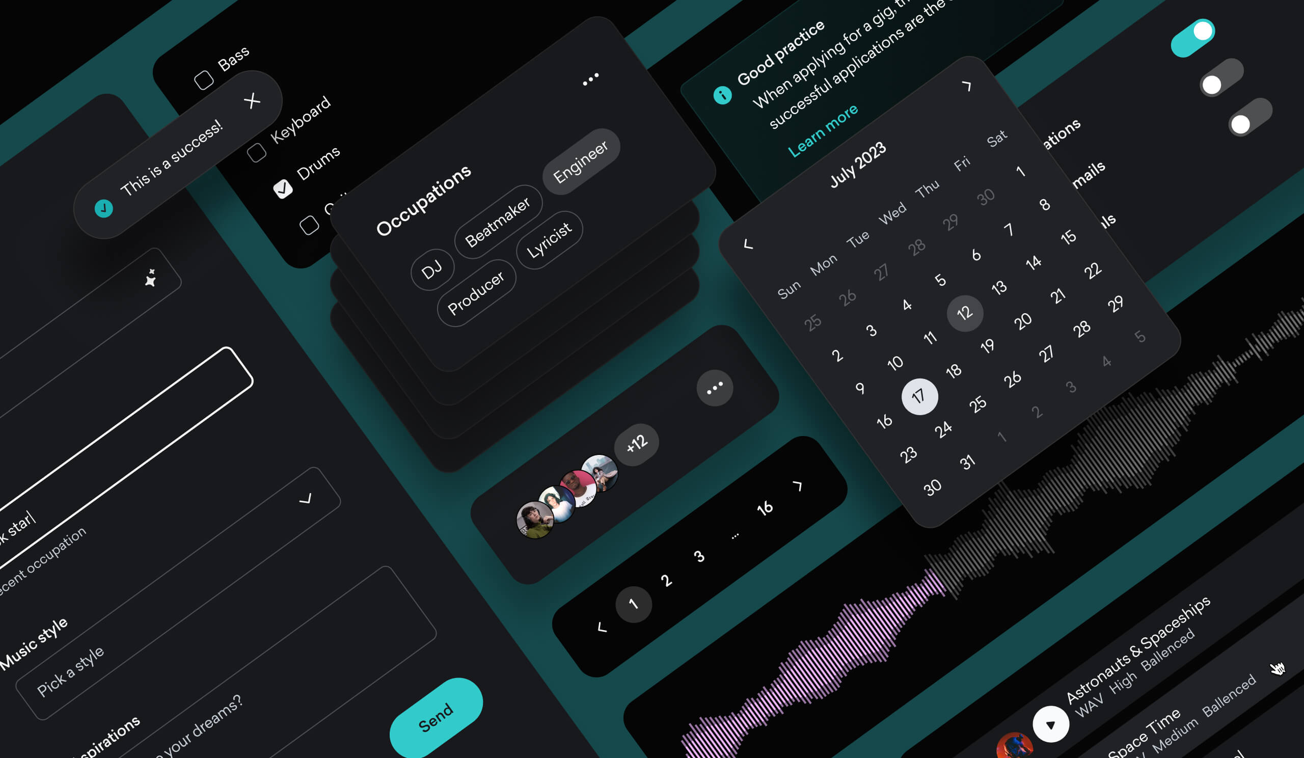
Maestro components
A preview of Maestro components.
The process
I started with a full audit of the platform, combing through every component in the LANDR ecosystem and organizing them using atomic design principles. This gave the team a clear roadmap. We dove straight into design and development, beginning with design tokens and the most frequently used components. Weekly check-ins kept the team aligned, helping us track progress and prioritize next steps.
I built each component from scratch, refining, testing, and shipping them weekly. This progressive approach made rolling out the new design system smooth for users and allowed us to quickly deliver or fix components as needed. As a bonus, it was a breeze to extend the design system to accommodate multi-brand support when LANDR acquired companies like Reason Studios and Synchro Arts.
On the design side, I faced a few hurdles—like keeping pace with tech changes and ensuring our component library stayed lightweight. The biggest surprise? Refactoring some of the more complex components so they were easily digestible by our AI tooling.
Micro interactions
Samples of built-in micro interactions.
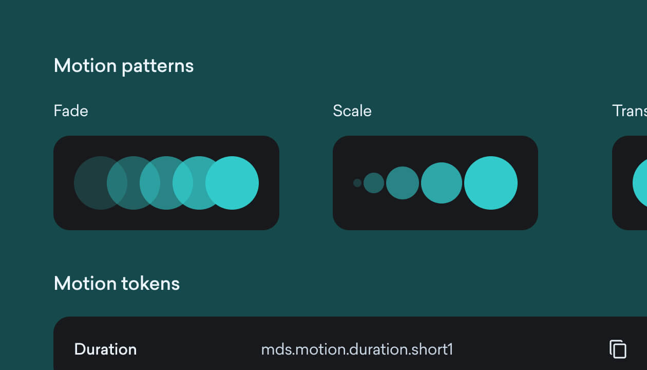
Motion patterns
Animation styles and tokens support.
Reflections
The result? A robust design system built on a solid codebase. It streamlined workflows for both design and front-end teams, eliminating redundant code and design rework. Most importantly, we achieved our goal: a smoother, more consistent user experience.
Adoption was strong, but we quickly realized that success depended on continuous improvement and collaboration. To make the system truly ours, we had to involve the development team—encouraging them to adopt it, adapt it, and contribute to it. After all, a design system only thrives if people actually use it.