Rad Cookie Ecommerce
Increasing online sales by 12%
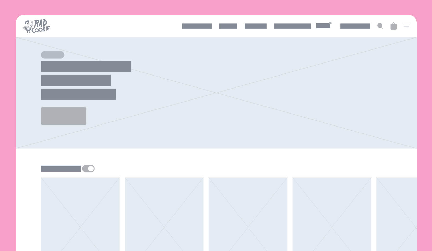
Preliminary wireframe
Early wireframe from the design phase.
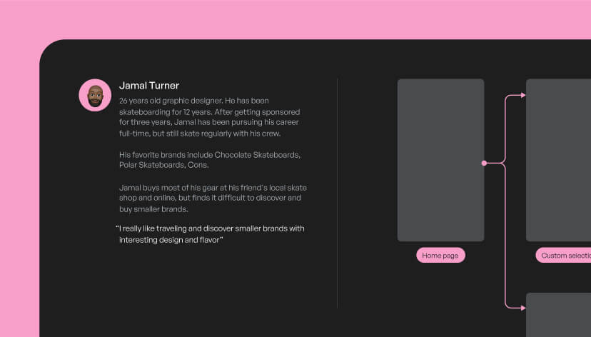
Persona
One of three personas based on user interviews.
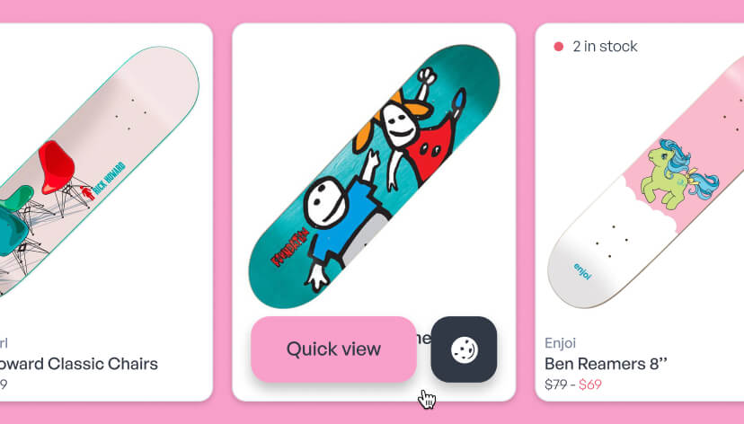
Rad Cookie product cards
Different states of product cards.
The situation
After years of growth in the skateboarding retail world, Rad Cookie’s ecommerce platform hit a wall. The old system was clunky, slow, and just not cutting it for users. It was time for a full makeover both for the platform and the brand.
The mission
I was tasked with redesigning the user experience and interface, teaming up with the marketing team to refresh the branding.
Usability testing revealed some major issues: users didn’t realize how much product diversity Rad Cookie offered, and they struggled to focus on new stock and styles.
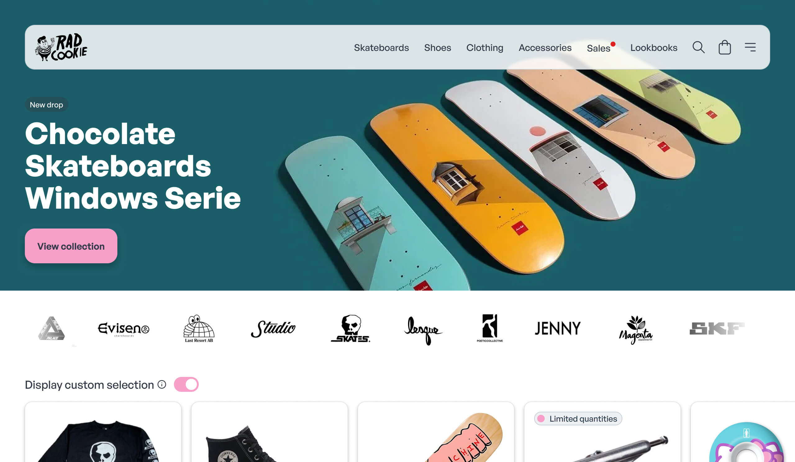
Home page
Featured product and personalized suggestions.
The process
Since the UX problems ran deep, I decided to start from scratch—redesigning and rebuilding the platform from the ground up. I gave extra love to the homepage and navigation, ensuring everything was simple, fast, and intuitive.
During ideation, I explored multiple design concepts, but none quite hit the mark. One idea, displaying only curated products on the homepage, left users feeling like they were missing out or unable to discover new items. After countless iterations and stakeholder discussions, I finally landed on a solution everyone loved. After some unforeseen tech hurdles, the revamped store platform went live.
The new design boosted the average number of items per transaction. Users could now browse curated lists and discover new products organically. I also redesigned the shopping cart to suggest products based on purchase history, seasonality, and even upcoming holidays. It wasn’t an easy sell, as development effort was a major concern. However, I delivered a scaled-down yet effective solution that worked.
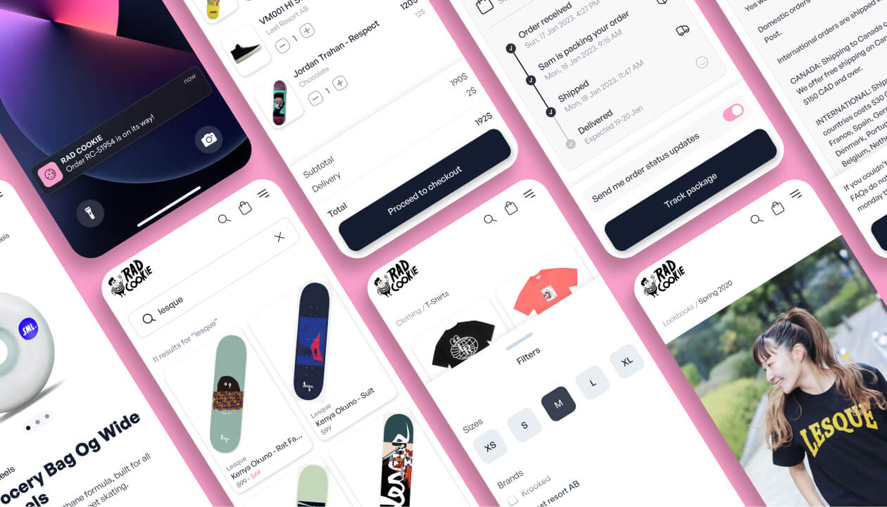
Miscellaneous screens
Some of the redesigned mobile screens.
Estimated time of arrival
ETA is calculated in realtime.
Reflections
The game-changer was letting users toggle between curated and filtered product modes boosting the average items per transaction. Combined with other improvements, this led to a 12% sales increase and a nice bump in customer satisfaction scores.
Prototyping and testing were my secret weapons. They helped me validate concepts early, ensuring we matched user needs and expectations. As a bonus, they gave stakeholders the confidence to fully back the redesign and allocate the resources we needed to see it through.